Completed: 2013
Skill Set: Front-End Web Design
Client: FilesAnywhere
.
DESCRIPTION
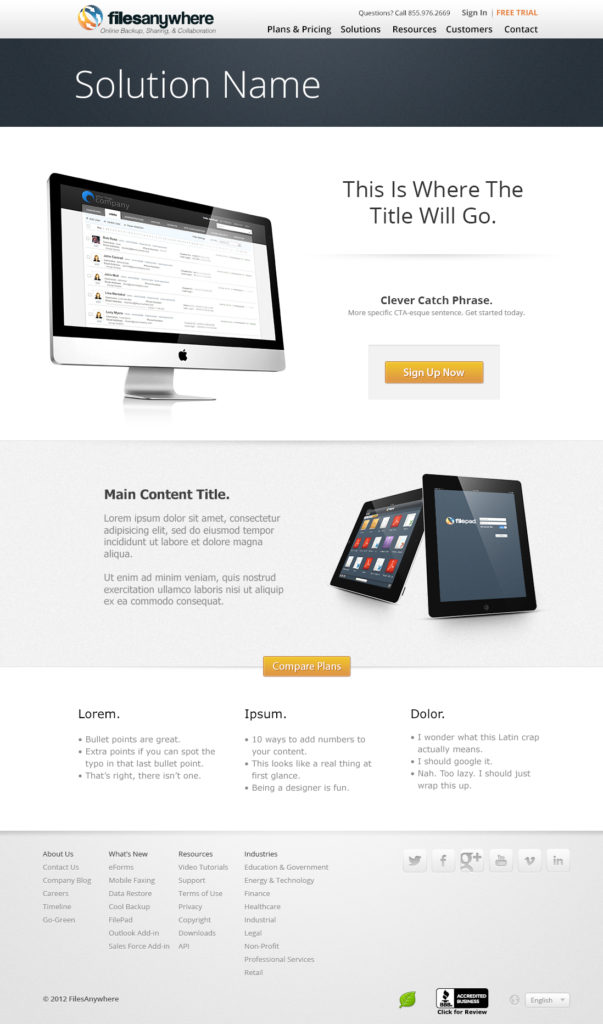
FilesAnywhere’s online presence was in dire need of a visual overhaul, so they brought me on to do just that.
.

PROBLEM
The old website was cluttered, gray, and difficult to navigate. Nothing attracted or directed the eye, and CTR was at an all-time low.
.
SOLUTION
I minimized the copy, increased CTA saturation, and gave it room to breathe, while balancing out written info with simple visuals that used perspective to point the eye toward the CTAs.
.
METHODOLOGY
The website was built on Microsoft’s ASP.NET framework, so I created sandbox copies of all my template pages, and then built and tested my design system in a live but inaccessible production environment.
I bought stock photos for the devices and used Smart Objects in Photoshop to insert the screenshots. Most of the finer details were done using Layer Styles.
.
CRITIQUE
Today I would’ve done all my building and testing in Adobe XD and then ported as much of it as I could into the serverside file system, hard-coding anything that still needed to be finessed or repaired.
Visually, this was a major improvement over what it was before, but admittedly, this design looks like every other landing page out there: clean and simple, but nothing stand-out or especially eye-catching.
