Completed: 2019
Skill Set: Branding, Website Build
Client: Kelly Treleaven (Author, Love, Teach: Real Stories and Honest Advice to Keep Teachers from Crying Under Their Desks)
.
DESCRIPTION
Kelly had a blog with a following of 6000+ people, but it was hosted on Blogger and she had been posting anonymously. She had just gotten a book deal and wanted a “legit” website to house her content before the book launched and her identity was revealed. That, and a fresh new custom logo.
.
PROBLEM
She didn’t know how to do any of that, and on her teacher’s salary, she couldn’t afford the people who did.
.
SOLUTION
I did the job pro bono, but kept it simple: bought web hosting with a custom url, installed WordPress, found a theme she liked, and migrated her content. While she cleaned up the formatting on the posts, I designed a type treatment to represent her brand.

METHODOLOGY
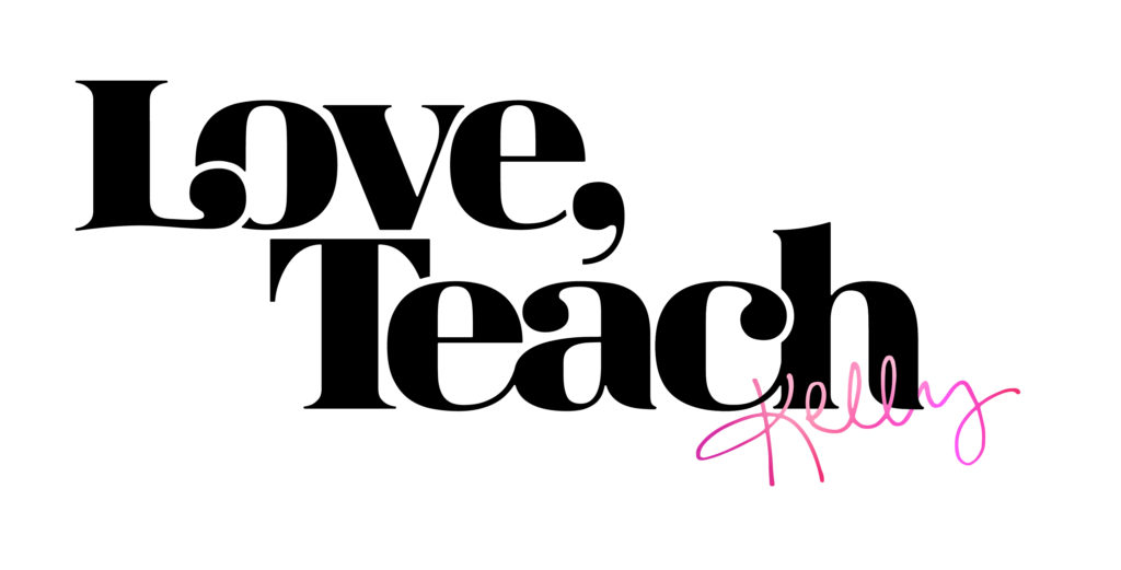
For the logo, I used the Magnel Display font, and crunched the kerning, creating ligatures where it made sense, and using negative-space strokes to accentuate the teardrop serifs that overlapped their neighboring letters.
Kelly wanted to personalize it with her actual signature, since the reveal of this logo would coincide with a blog post revealing who she was. I got her to send me a page full of signatures, and used the best parts of each to construct the pink “Kelly” in the corner.
For use cases where square or circular form factors were necessary (e.g. social media profile pictures and favicons), I brought the L and T together, accentuating the signature serif stroke from the original type treatment. This suggests the presence of the comma without having to include it.

CRITIQUE
Compositionally speaking, I’m still on the fence about whether or not adding the signature was the best call. Ultimately, it’s up to the client, but I had my reservations and didn’t voice them. I do love that the cover artist for her book took inspiration from my work!