Completed: 2019
Skill Set: Branding, Animation
Client: The Table
.
DESCRIPTION
The Table is a Christian church in Sachse, Texas whose vision is to shift a generation from reactionary to visionary through the person and work of Jesus. Their core values center on being thoughtful, inclusive, eclectic, communal, and vulnerable. When they got their start in 2019, they came to me to create their brand.
.
PROBLEM
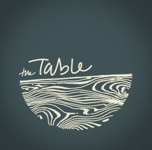
They wanted something that felt hand-made, grounded in humanity, and perfectly flawed. It needed to reflect that everyone has a seat at The Table, and it was important that I included wood grain, not just to reference the Carpenter’s table, but also the cross upon which he was lynched.
.
SOLUTION
I delivered.


METHODOLOGY
I collaborated with the church’s Art Director to hand-draw the name and wood grain, then digitized it and created a color palette.
We went with a circular form factor to reference the egalitarianism of a round table, while leaving the top half open to symbolize the church’s openness to all who would want a seat at The Table.
A thicker, solid line runs atop the wood grain to suggest a firm and stable tabletop that can support anything it’s called upon to carry.
I intentionally used the handwriting of someone who hates their handwriting, to represent that this church is a safe place for the things people carry shame and/or guilt around, and that only by getting them out into the open can we enable out community to offer the support and encouragement we often need in order to forgive and accept ourselves as we are.
.
CRITIQUE
The whole mark does get muddy when you scale it down to a favicon or email signature. The word mark can be used on its own, but the wooden semicircle really embodies most of what the logo is meant to convey. Given its level of intricacy and detail, anywhere this full logo is implemented, it would have to be fairly large, which limits its use case potential.