Completed: 2022
Skill Set: Branding
Client: Outlook Dental
.
DESCRIPTION
Outlook Dental existed as a dentistry and orthodontia practice, but didn’t have any type of branding or online presence outside of being listed in directories. They came to me to get them started.
..
METHODOLOGY
The “outlook” idea came from the idea of patients looking forward at their future selves with healthier, more beautiful teeth. It’s a fairly abstract concept, so I had a lot of room to play. I started with a series of simple sketches to convey basic ideas. The funnel is steep when it comes to narrowing down our vision, so I prefer not to spend any more time than I need to on ideas that don’t make the cut.
METHODOLOGY (cont’d)
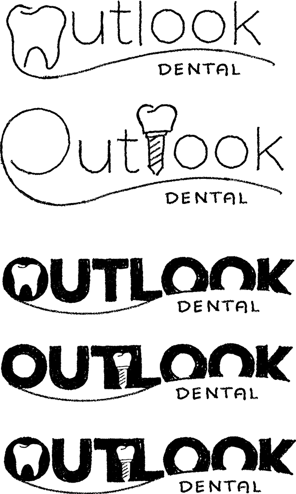
After sending my first wave of roughly sketched concepts, the client came back with a sketch of their own. Because of course they did.
I took it and ran with it, creating two variations of the idea, stressing to them that it would be best to choose between the tooth and the dental implant, rather than using both (right).
Once they selected the bold typeface with the negative space dental implant, I took to Illustrator to produce the final product (below).
.
CRITIQUE
I think the logo is fine for what it needs to be, but I would’ve preferred to push harder for a mark that was more iconic than just a type treatment. The implant is clever, but overall, I don’t feel this logo is as novel or memorable as I know I was capable of making it.

