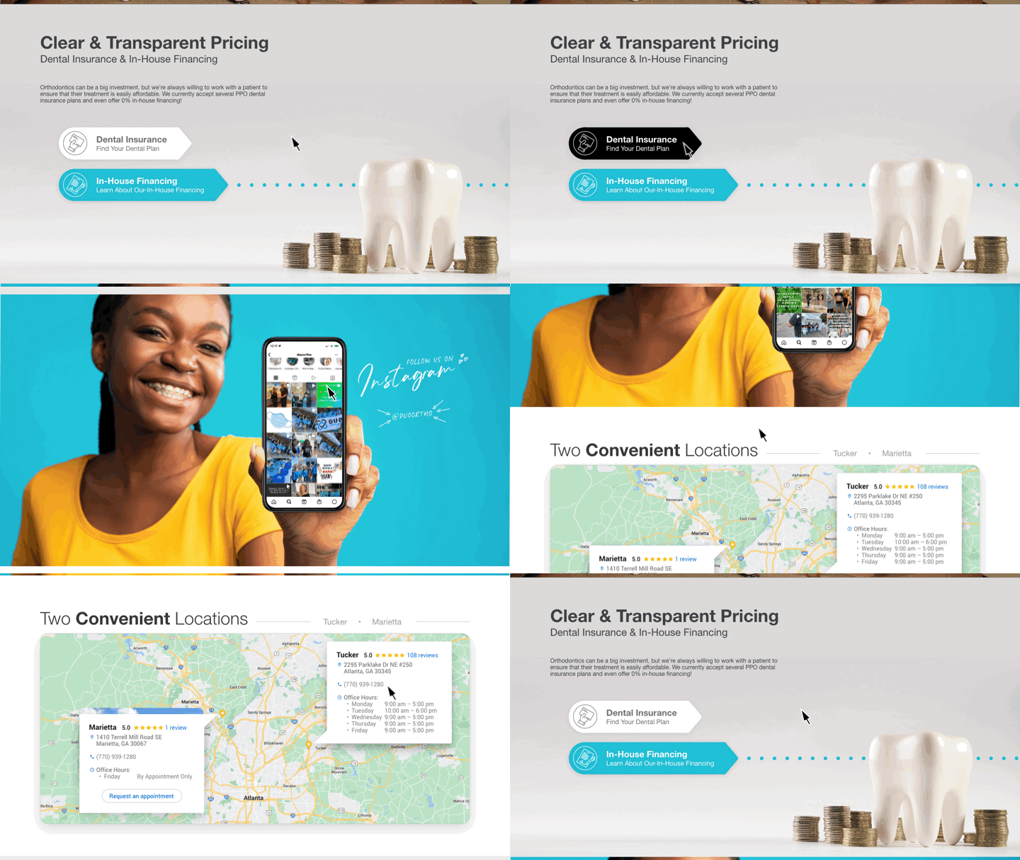
Completed: 2022
Skill Set: Website Design
Client: Duo Orthodontics
.
DESCRIPTION
I applied to be a designer for a company that builds websites for dentists. They noped my application, so I noped their “nope”. I told them if they sent me a spec project, I’d turn their “nope” into a “yep”. This is that project. And yes, it yepped their “nope”.
.
PROBLEM
The client’s current site is chaotic, overwhelming, and likely a plug-n-play template someone threw together in a matter of minutes.
.
SOLUTION
I took the color palette and important information from their homepage, and reimagined it with spaciousness, simplicity, and interactivity in mind.
⤹ Live preview
METHODOLOGY
I learned Adobe XD while working on this project. Everything that could be build in XD was built in XD – all the way down to the gold stars in the Google reviews section.

CRITIQUE
The developers at the agency use a custom CRM, and I wasn’t able to get a clear answer as to how doable some of these elements were for them. Although this was only spec, I still don’t like writing checks that can’t be cashed – especially when it’s someone else doing the cashing. It’s a great design, but there’s no point in mocking it up if it can’t actually be built.